Tattoo fonts guide

Tattoo Fonts: 20 Lettering Styles & Readability Guide

Compare script, blackletter, Chicano, typewriter, and serif tattoo lettering with visual examples, readability notes, and placement guidance before making a draft.

These are lettering style presets for tattoo drafts, not installable font files.

Real tattoo font examplesBest uses and readability notesReadability guidance before generating lettering

Popular tattoo font families

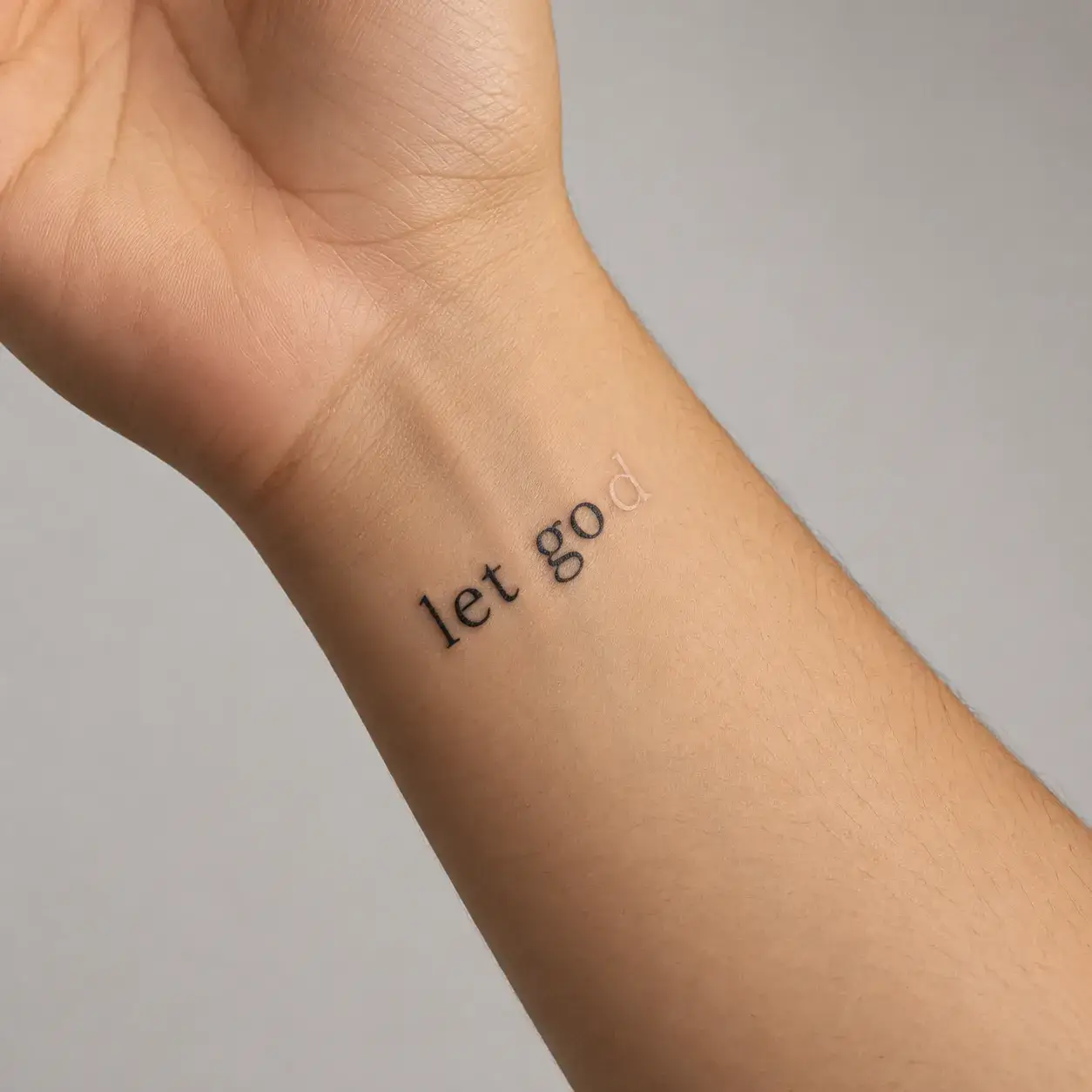
Clean & Minimal

Balanced everyday clarity for wrists, dates, and first tattoos.

Script & Personal

Flowing handwritten and calligraphic styles for names and quotes.

Bold & Traditional

High-impact lettering built to stay crisp for decades.

Gothic & Old English

Dramatic blackletter weight for surnames, initials, and statements.

Vintage & Inscription

Literary typewriter, chiselled Roman numerals, and Americana slabs.
Street & Chicano

Expressive urban script, banners, and graffiti energy.

Tattoo font styles

SHOW TATTOO FONTS FOR
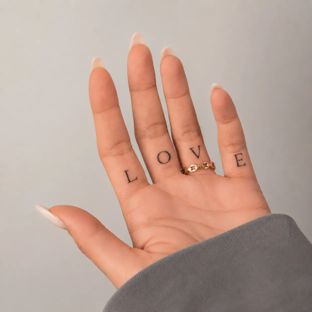
Classic

Classic

Clean
Try this style
STYLE FEEL
Timeless, balanced, understated
OFTEN CHOSEN FOR
Names, short quotes, literary words
READABILITY
High — open letter counters stay sharp over time
BEST WHEN
You want clean typography that never feels dated.
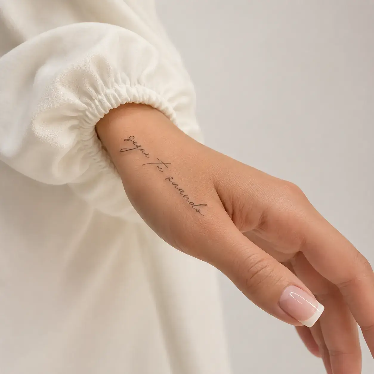
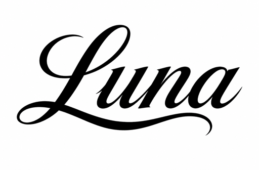
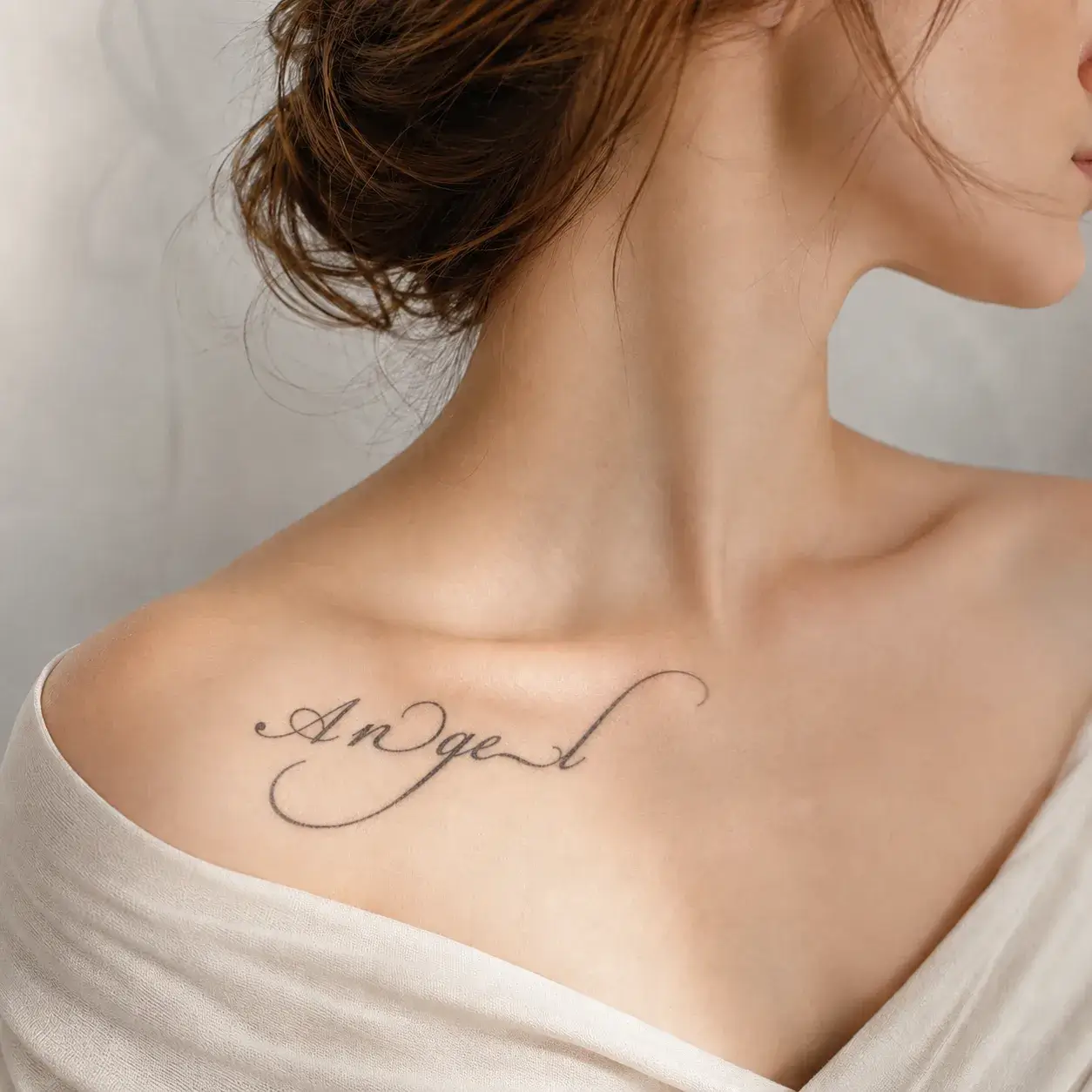
Script

Script

Script
Try this style
STYLE FEEL
Flowing, personal, graceful
OFTEN CHOSEN FOR
First names, personal mottos, rib & collarbone lines
READABILITY
Medium-High when given generous spacing
BEST WHEN
You want warm, expressive movement along body curves.
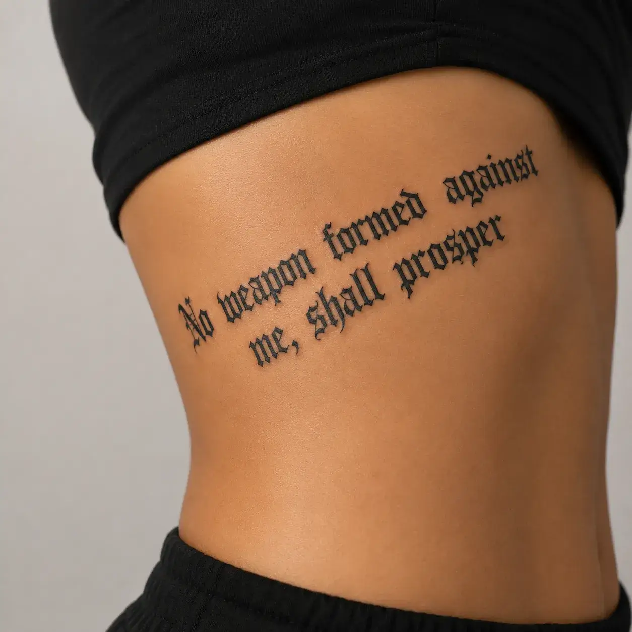
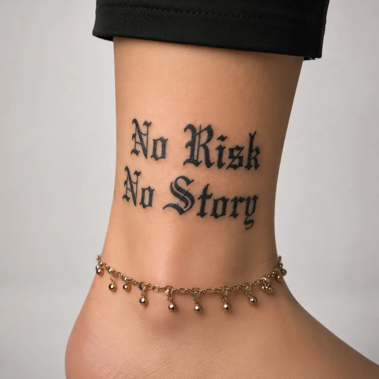
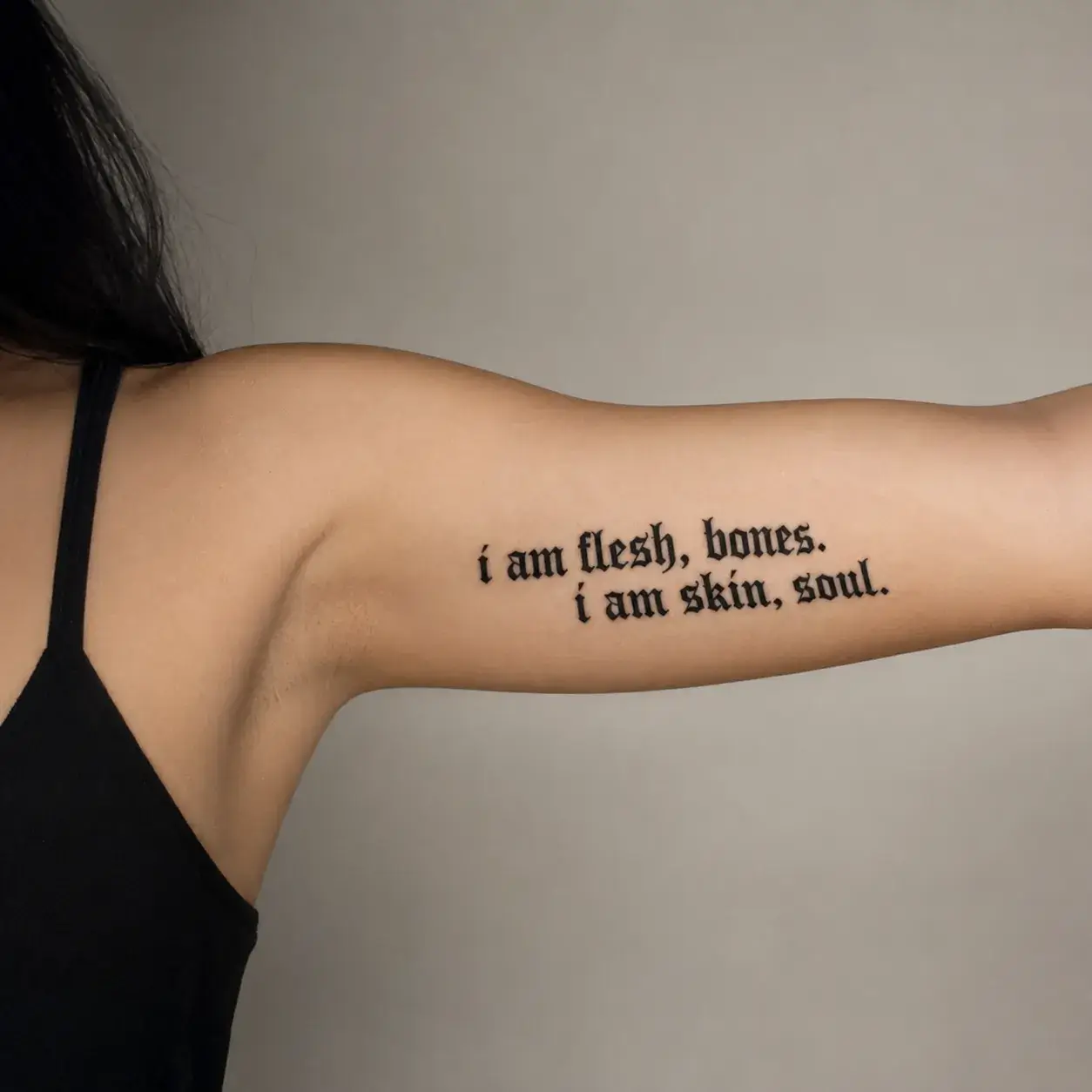
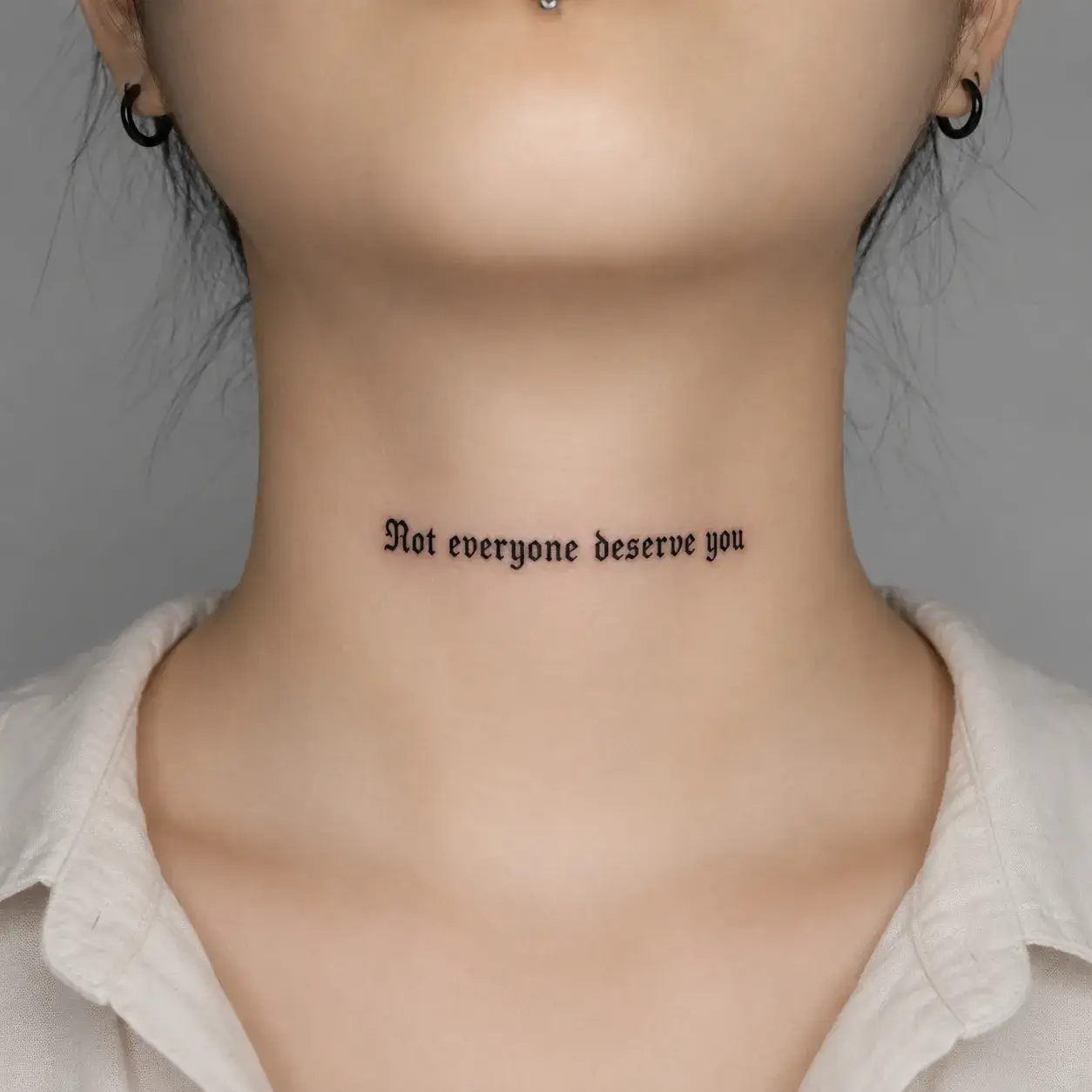
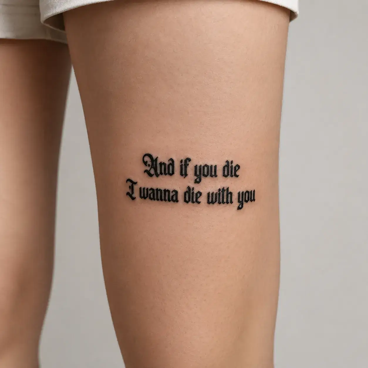
Blackletter

Blackletter

Gothic
Try this style
STYLE FEEL
Dramatic, medieval, heavy black ink
OFTEN CHOSEN FOR
Surnames, chest banners, single bold words
READABILITY
Medium — strongest at medium-to-large sizes
BEST WHEN
You want unmistakable graphic weight and attitude.
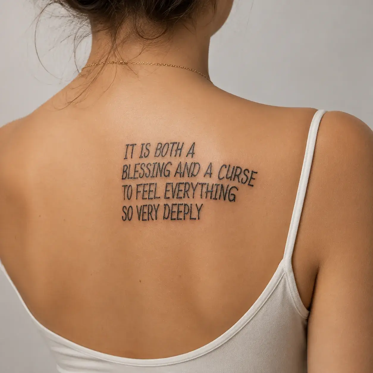
Typewriter

Typewriter

Vintage
Try this style
STYLE FEEL
Nostalgic, editorial, intimate
OFTEN CHOSEN FOR
Dates, coordinates, short poetic lines
READABILITY
High — monospaced rhythm prevents crowding
BEST WHEN
You want a diary-like, literary aesthetic.
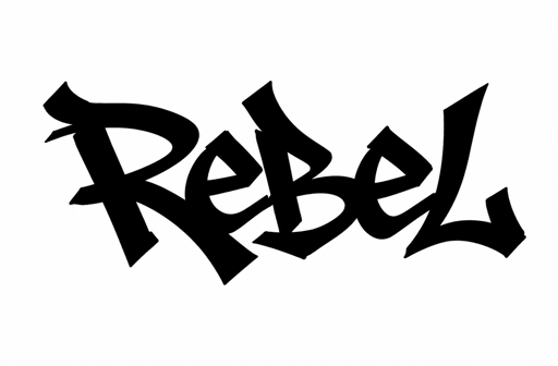
Chicano

Chicano

Street
Try this style
STYLE FEEL
Sharp, ornate, West Coast heritage
OFTEN CHOSEN FOR
Family names, forearm statements, heritage pieces
READABILITY
Medium — intricate tails need generous width
BEST WHEN
You want expressive street script with strong presence.
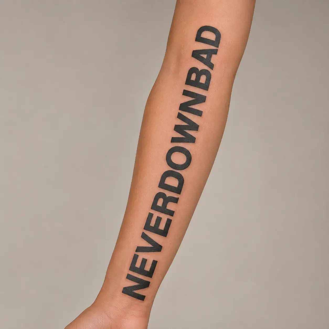
Block
STYLE FEEL
Solid, architectural, unmistakable
OFTEN CHOSEN FOR
Bold words, initials, dates, sports numbers
READABILITY
Very High — among the best aging lettering styles
BEST WHEN
Legibility and crisp edges decades later matter most.
Minimalist

Minimalist

Clean
Try this style
STYLE FEEL
Airy, modern, feather-light
OFTEN CHOSEN FOR
Small wrist words, initials, quiet reminders
READABILITY
High at small-to-medium scale with clean kerning
BEST WHEN
You want subtle everyday ink for a first tattoo.
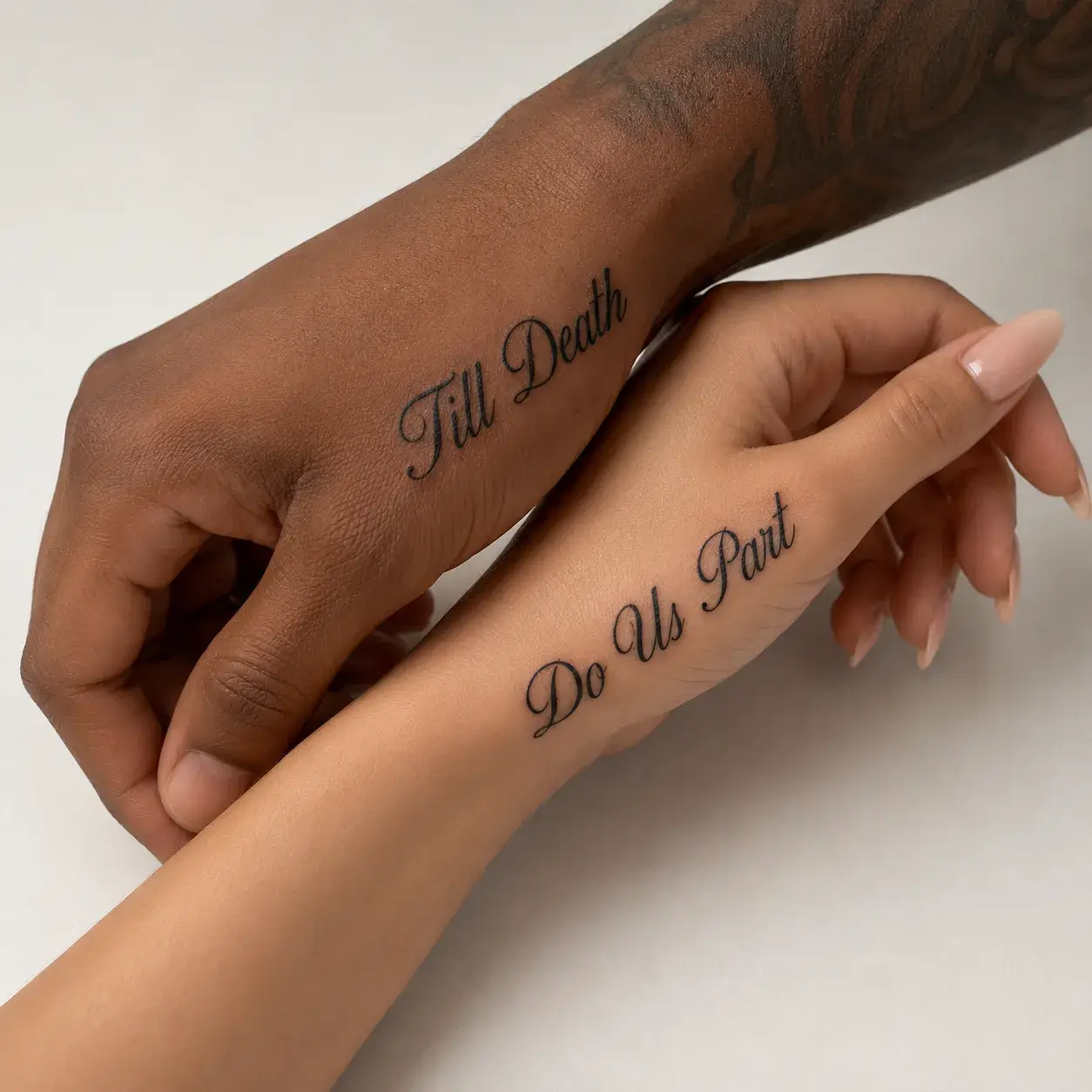
Cursive

Cursive

Script
Try this style
STYLE FEEL
Fluid, romantic, continuous
OFTEN CHOSEN FOR
Loved ones’ names, brief affirmations
READABILITY
Medium-High with open loops
BEST WHEN
You prefer connected cursive without heavy flourishes.
Handwritten

Handwritten

Script
Try this style
STYLE FEEL
Warm, human, authentic
OFTEN CHOSEN FOR
Personal notes, tribute signatures, short phrases
READABILITY
High — natural spacing feels effortless
BEST WHEN
You want the tattoo to feel like a real note on skin.
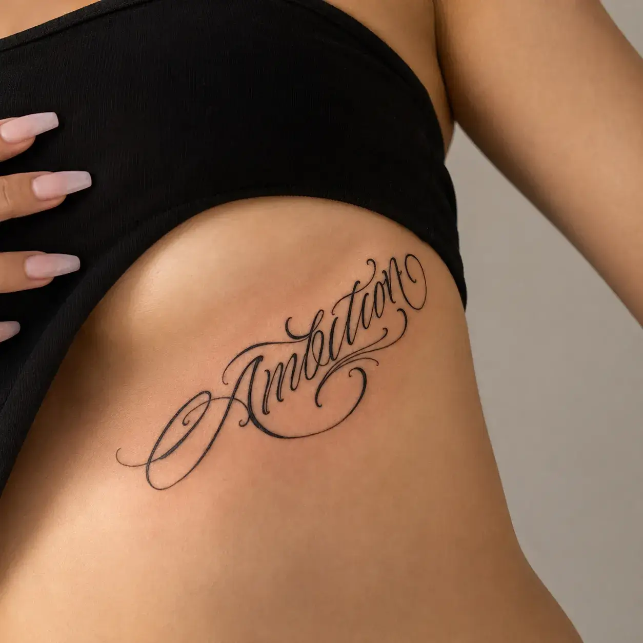
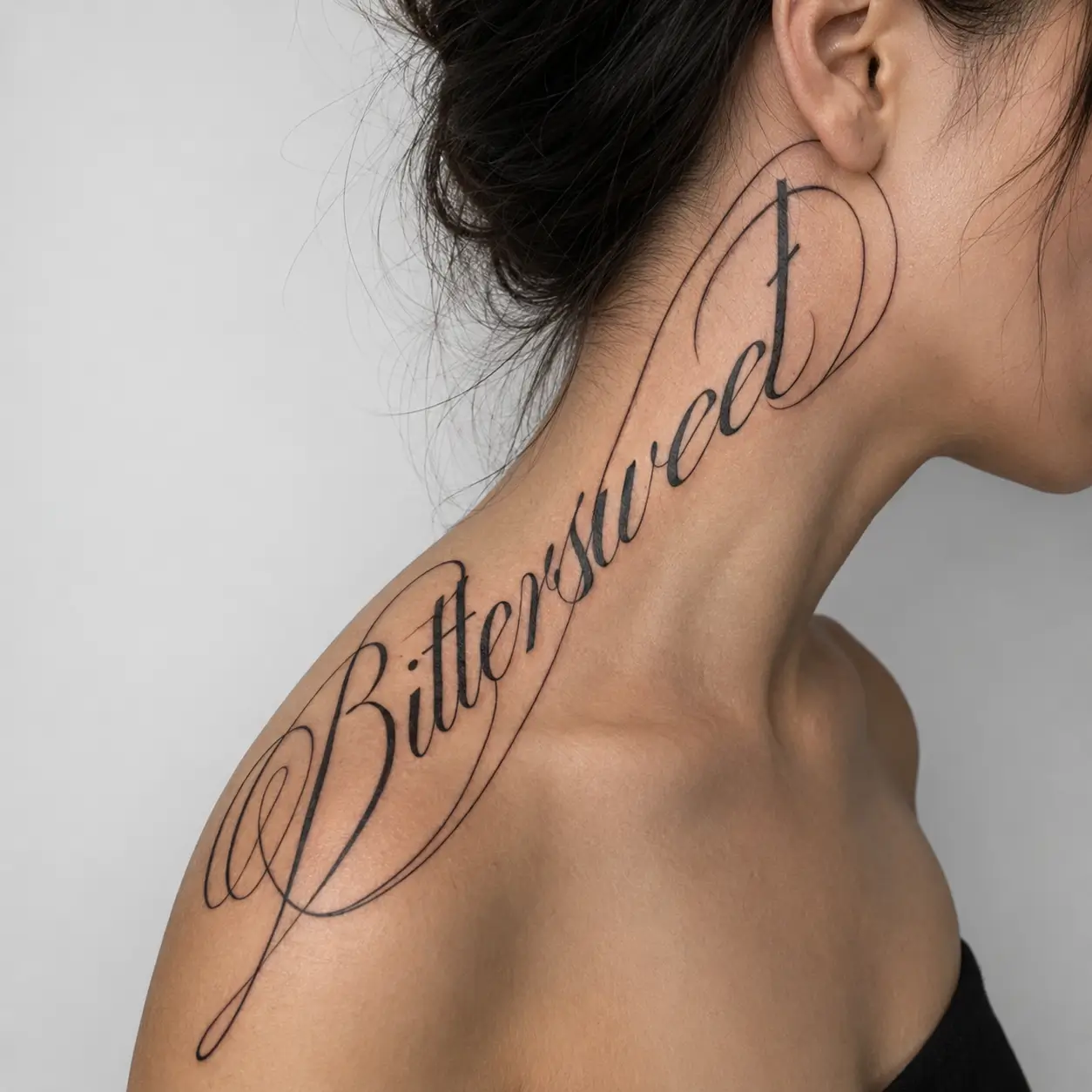
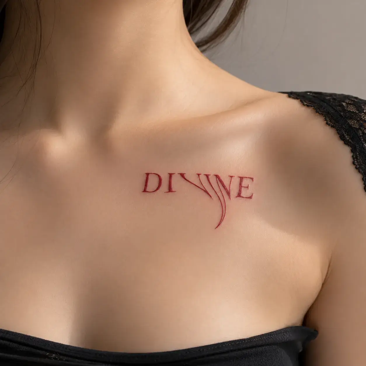
Calligraphy

Calligraphy

Script
Try this style
STYLE FEEL
Refined, ceremonial, high contrast
OFTEN CHOSEN FOR
Names, single words, vertical spine or rib lines
READABILITY
Medium — flourishes shine at medium size
BEST WHEN
You want thick-and-thin dip-pen elegance.
Old English

Old English

Gothic
Try this style
STYLE FEEL
Heritage, ornate, iconic
OFTEN CHOSEN FOR
Initials, family names, birth years
READABILITY
Medium — capital initials read strongest
BEST WHEN
You want classic Old English legacy lettering.
Roman

Roman

Vintage
Try this style
STYLE FEEL
Classical, chiselled, dignified
OFTEN CHOSEN FOR
Roman numeral dates, Latin phrases, initials
READABILITY
Very High — crisp serif structure
BEST WHEN
You are tattooing dates like MCMXCVIII or short mottos.
Gothic

Gothic

Gothic
Try this style
STYLE FEEL
Sharp, moody, bold
OFTEN CHOSEN FOR
Single words, initials, dark aesthetics
READABILITY
Medium — best at medium-to-large scale
BEST WHEN
You want crisp dark-fantasy or metal-inspired lettering.
Dark

Dark

Gothic
Try this style
STYLE FEEL
Edgy, spiky, contemporary dark
OFTEN CHOSEN FOR
Short statement words, cybersigilism pairings
READABILITY
Stylized — prioritizes silhouette and attitude
BEST WHEN
You want lettering that blends with blackwork or sigils.
Gangster

Gangster

Street
Try this style
STYLE FEEL
Heavy, condensed, unapologetic
OFTEN CHOSEN FOR
Forearm & chest banners, area codes, nicknames
READABILITY
High at medium-to-large placements
BEST WHEN
You want bold old-school street banner impact.
Generic

Generic

Clean
Try this style
STYLE FEEL
Neutral, clean, versatile
OFTEN CHOSEN FOR
Everyday words, dates, first-time drafts
READABILITY
Very High across almost every size
BEST WHEN
You want a clean baseline to compare against stylized fonts.
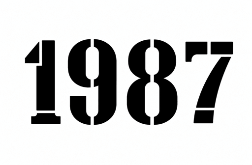
Stencil

Stencil

Bold
Try this style
STYLE FEEL
Industrial, graphic, crisp
OFTEN CHOSEN FOR
Dates, coordinates, bold single words
READABILITY
High — segmented bridges stay distinct
BEST WHEN
You want utilitarian graphic precision.
Traditional

Traditional

Bold
Try this style
STYLE FEEL
Old-school, bold, timeless
OFTEN CHOSEN FOR
Banner mottos, tribute words, traditional sleeves
READABILITY
Very High — engineered for tattoo longevity
BEST WHEN
You are pairing lettering with roses, daggers, or swallows.
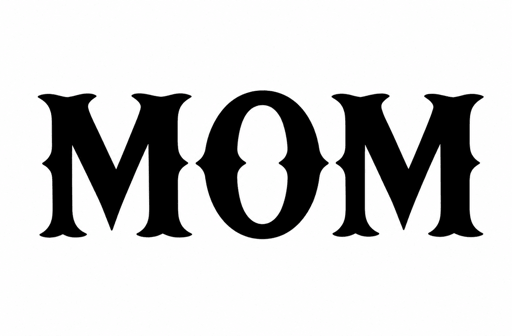
Western

Western

Vintage
Try this style
STYLE FEEL
Americana, rugged, vintage slab
OFTEN CHOSEN FOR
Single words, hometowns, bold initials
READABILITY
High at medium scale
BEST WHEN
You want distinctive vintage Americana character.
Graffiti

Graffiti

Street
Try this style
STYLE FEEL
Energetic, urban, expressive
OFTEN CHOSEN FOR
Nicknames, tags, bold forearm pieces
READABILITY
Stylized — prioritizes urban flow and energy
BEST WHEN
You want dynamic street-art lettering.

How to choose readable tattoo fonts

Small tattoo fonts need simple forms

Open counters and minimal flourishes prevent ink from merging as skin naturally ages.

Long quotes need breathing room

Split quotes into clean lines with open spacing rather than shrinking letters to fit a narrow space.

Dense lettering needs enough size

Blackletter, Old English, and Chicano styles shine on forearms, chests, and backs.

Artists should refine final stencils

Bring your preview as a direction and let your artist fine-tune kerning and needle gauge.

Tattoo fonts questions